Asan Medical Center App
- My Role
- User Research / UI Design / Wireframing / Usability Testing
- Period
- Feb 2021 - Aug 2022
- Tools
- Figma
- Company

Background
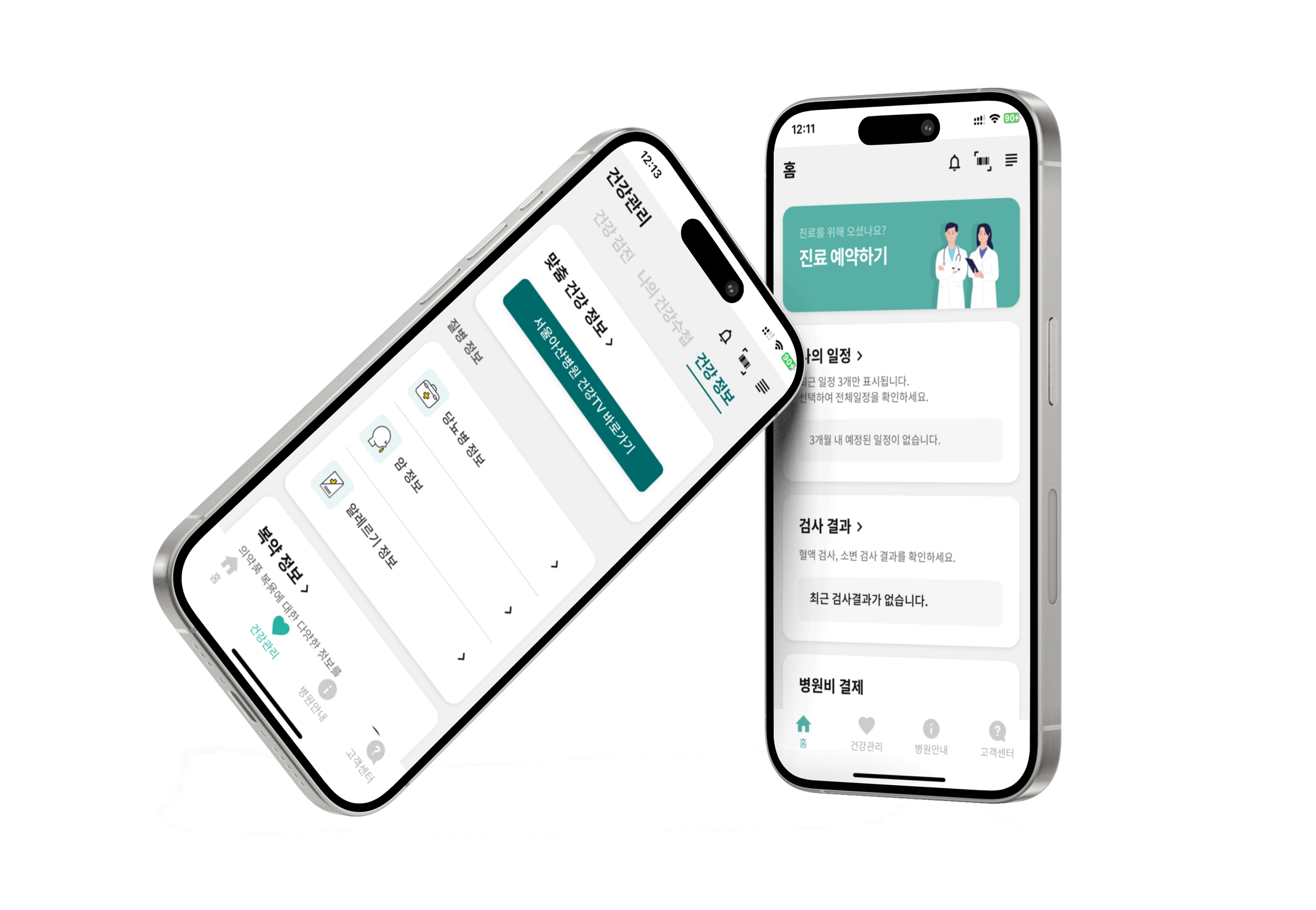
I was involved in the development and enhancement of the Asan Medical Center app has been downloaded over 100,000 times. This app was developed by an external development company upon a request from the hospital. As a UX designer at the hospital, my goal for this project is to enhance usability and restructure the design, ensuring that patients and their caregivers can use the hospital app more easily.
Role
As the Lead UX Designer for this project, I took charge of designing the UI for several key features of the app during its initial release. Having joined the project midway through its initial phase, I pinpointed areas for UX enhancement. This was achieved through heuristic evaluations, in-depth interviews, and usability testing. I also took on the role of facilitator during these user research sessions. After the app's launch, my focus shifted to refining the information architecture and reworking wireframes for all menus to guarantee continuous UX improvement.
Usability Evaluation
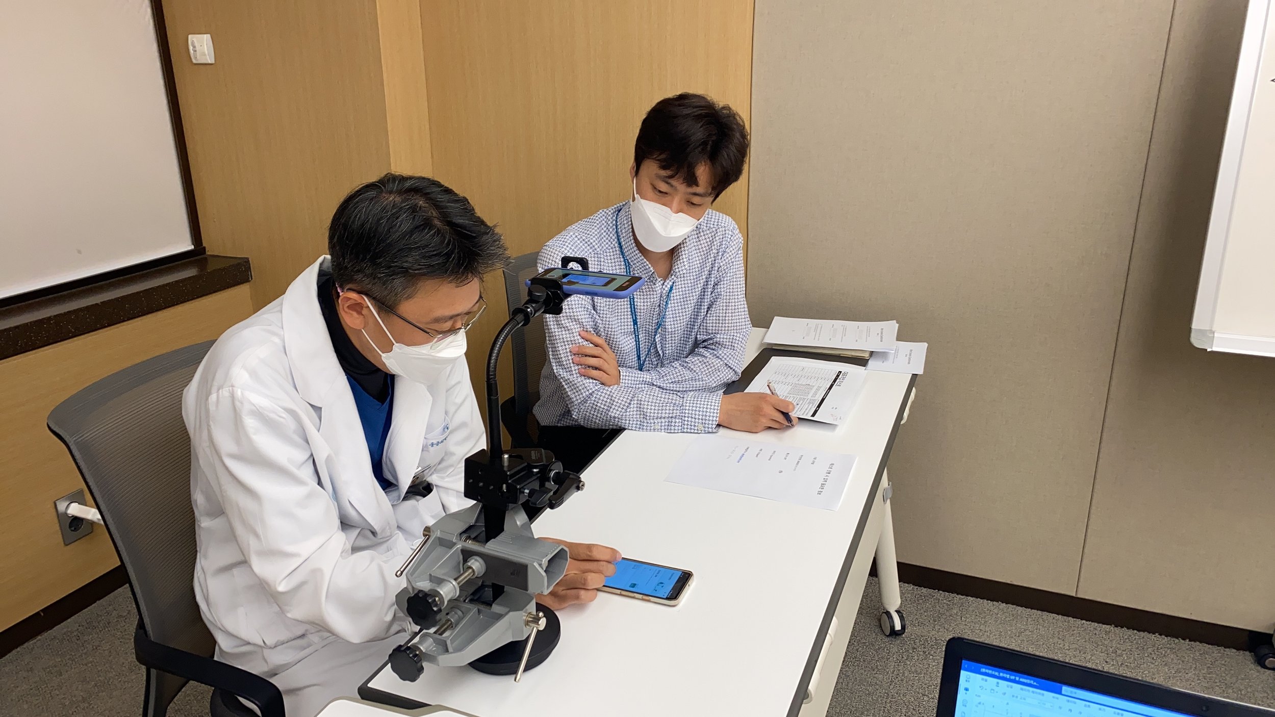
I conducted usability testing with 12 participants. I asked participants to carry out the app's primary tasks. During this process, I used the contextual inquiry method to ask questions. Once they finished, we conducted an After Scenario Questionnaire (ASQ) survey and an in-depth interview.
1 Usability Testing
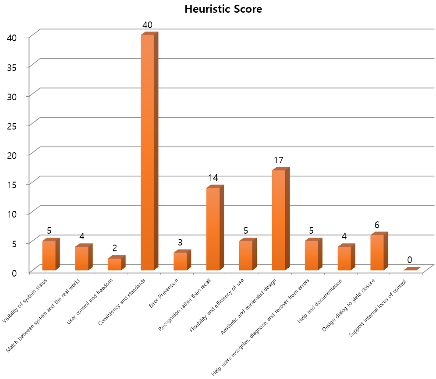
Including me, four UX evaluators carried out a heuristic assessment of the app. We found 105 usability issues, especially with consistency, a lack of intuitiveness, and a design that wasn't aesthetic and minimalist.
2 Heuristic Evaluation
Key Findings
• The app has too many features and a confusing structure, making some functions not listed on the home screen hard to find.
“They really hid the sign-up menu, huh? It was so annoying trying to find it. I don't think an app should make it this hard to locate.”
• Medical and hospital-related information is either lacking or not user-friendly, making it tough to understand.
"Ugh... Can I really find it with this map? I feel like I won't be able to locate it because I don't even know where I am. I'll probably end up asking someone for directions again.”
• Users find it cumbersome when manual input is needed for tasks that could be automated.
"I wish it would auto-fill for me. It's quite bothersome to input this manually, and while there might be benefits to navigating this tricky menu and entering details daily, most people, including me, would probably skip it because it's just too tedious."
Information Architecture
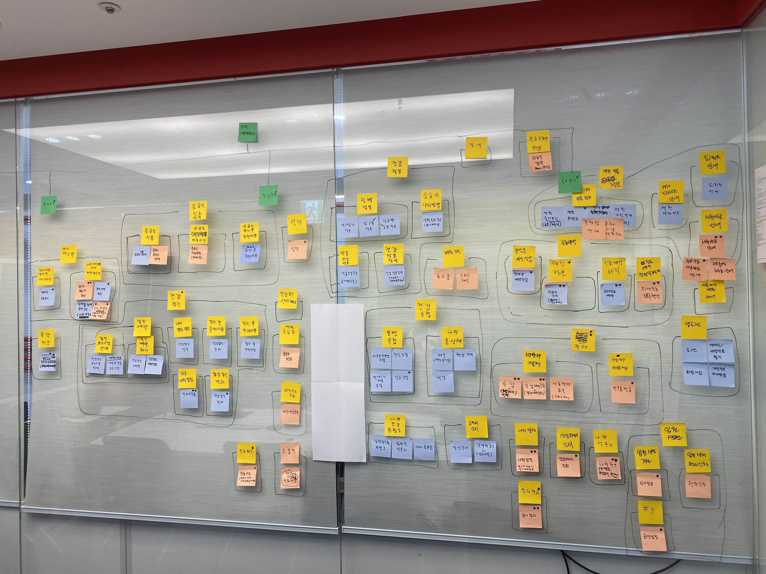
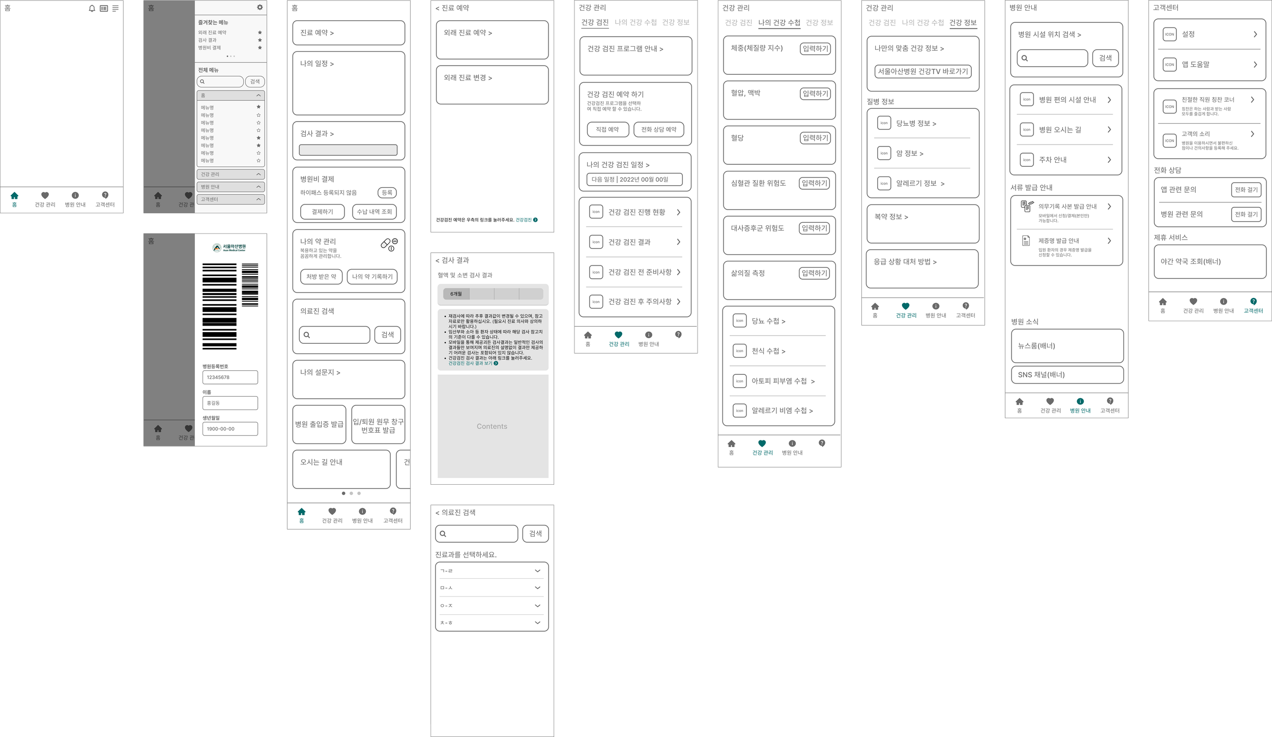
To improve the app's menu structure, I turned all the menus into cards and conducted card sorting. Based on that, I redesigned the information architecture.
.png)
Wireframe
Takeaways
This project required navigating numerous constraints within the medical environment. The app had many menus, but data showed most were rarely used. Despite this, removing or adjusting them was challenging due to the influence of various medical department stakeholders. Additionally, the app, developed and managed externally, didn't allow patients to view their hospital medical data or input records automatically—areas with clear room for improvement.
A significant observation was the difference in perspective between medical professionals, who often made decisions, and the patients and caregivers. Medical staff, while experts in healthcare, aren't necessarily adept at crafting digital products. I see a pressing need for more user-centric designers to be involved in such projects, ensuring better user experiences for patients and caregivers.